Last month, in mid August, for my 26th birthday, one of the best gifts I was given was John Carpenter's "The Fog" on Blu-Ray. I already love the film, but I fell back in love with it again after watching it in such a crystal clear format. This actually swayed me in the way of officially being a fan of Blu-Ray, I've always liked them but, I like having my films look gritty and old, it adds a creepy factor, and I believed clear picture quality would kill that aspect. What I didn't anticipate is, that the old feel of the film is still there, even though the picture is astoundingly clear. So, I admit that I was wrong to assume. "The Fog" is by far the clearest transfer I've seen of an 80's horror film to Blu-Ray.
However, not only did I enjoy the new special features, but what was really the icing on the cake for me, was the cover art. I absolutely love the cover, and how it looks retro, yet it's new. I particularly like how it captures the feel of the motion picture in such gorgeous artwork. Thing is, "The Fog" is actually my 2nd favorite horror film poster of all-time, right after "The Howling".
So, as much as I enjoy the new cover the collector's edition provides, it arose a question: do I like it more than the original poster art. The answer was a bit bitter...
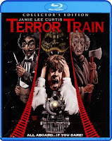
After looking at some of the other Blu's that I own, as well as ones that I plan on getting, it's unbelievable how fantastic the cover of these movies are, and they really compliment the films in which they represent. Shout Factory has been knocking them out of the park left and right! As much as I love the original poster art to these classics, the new artwork for them is undeniably better. Unless you're not a fan of art, I'm certain most people agree with me.
However, as great additions as these new cover arts are, they're not replacing the classic posters that are embedded in my head. Maybe it's because I grew up with these awesome films, so I have memories attached to them and their older covers. Or maybe it's simply because somewhere deep, inside I find myself attached to the primordial advertising, since it's what I'm used to.
What I've come to conclude is that, even though the newer artistic Blu-Ray covers are superior, they'll never replace the originals. Reason being, what comes to my mind when I think of these films is, the original covers back from the days of V/H/S, which are mostly all of the films' theatrical poster art. The new updated look the videos are providing are great, and make nice additions to any film collection. But, if you're a cinema buff, you have a picture that comes to mind when you think of certain motion pictures. And new, creative covers aren't going to change that.
So in short, I would use the word gorgeous to describe the new looks of the films. But, unless you're just getting into the movies put out on these editions, I don't think you'll find these covers anything more than an awesome take on the cinema's you cherish. They're clean, better designed, well done, and almost impossible to not stare at, but they're simply not the classics. And as Chucky would say, "a true classic never goes out of style".
WHICH DO YOU PREFER?


Thanks for the old / new comparisons. I've been impressed by this new artwork, too. It's a damn sight better than, say, the astoundingly bad cover art on the first dvd release of Happy Birthday To Me.
ReplyDeleteThe UK company Arrow Video has turned out some fine looking original artwork over the last year or two, as well.
Arrow Video actually has Maniac Cop coming out later this year, and I am envious because the cover art for it is amazing! I need to get a player that'll play both regions.
DeleteI too am loving the new artwork being created for some of these classics, in the UK ARROW are doing something similar to what Shout are doing. However, I tend to end up flipping the artwork to show the original release artwork, just because I still tend to lean towards it, for nostalgic reasons. Not sure if Shout have the original artwork on the reverse of the sleeve too.
ReplyDeleteThe new stuff is great, but I think the original The Burning, Terror Train and Prince of Darkness are far superior to what you have shown up there. Sometimes the cartoonish-ness of the newer artwork doesn't always suit the tone for me. But hey, atleast it isn't something badly photoshopped with the actors heads on the front, like the re-issued Near Dark, for example.
Yeah, Shout has the reversible sleeves as well. I actually switched my sleeve for The Fog to the original classic cover, since I have the slip cover for it, and the slip cover has the new artwork. So I get the best of both worlds. Never saw that Near Dark you're referring to. I'm going to have to check that out for laughs haha.
DeleteThey tried to make it look like Twilight... enough said.
DeleteOh no...
Delete